What Your Website Communicates Before a Visitor Reads a Single Word
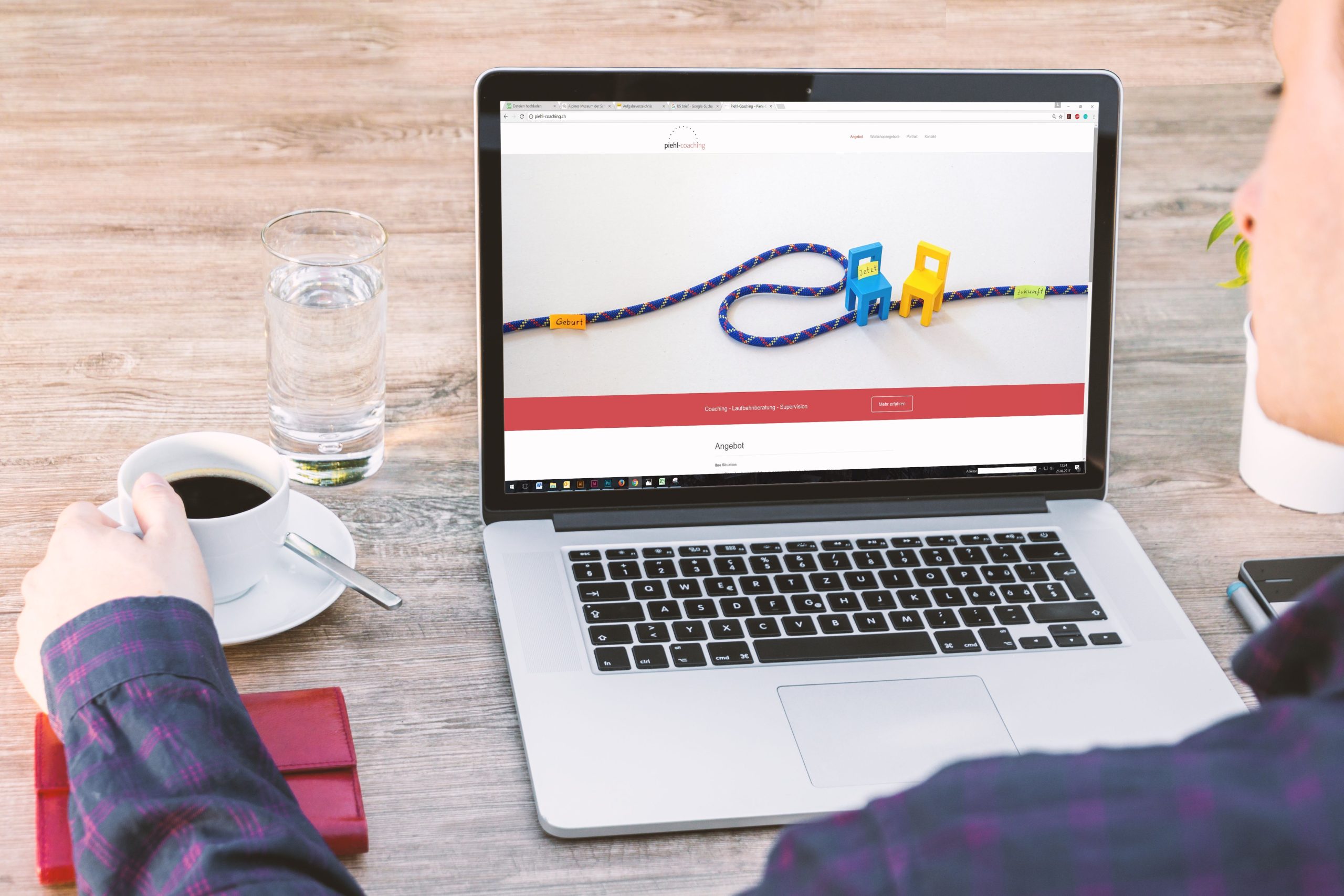
A website starts communicating the moment it appears on a screen.
Before a visitor reads a headline, clicks a button, or studies a paragraph, they are already forming an impression based on what they see. Layout, spacing, photography, colors, typography, speed, and overall organization all send signals about the business or organization behind the site.
That first impression may only take a few seconds.
If the website feels polished, current, and easy to understand, visitors may assume the company is organized and professional. If the site looks cluttered, outdated, confusing, or difficult to use, they may begin questioning the quality of the business before learning anything about its services.
That is why visual communication matters so much in web design.
Design Creates an Immediate Emotional Reaction
People respond to visual information quickly.
A clean, spacious layout can feel calm and professional. Bold colors and large imagery may feel energetic and modern. A dark, dramatic design can create a completely different mood than a bright, minimal one.
None of these approaches is automatically better than another.
What matters is whether the visual style fits the organization.
A law firm, children’s ministry, construction company, medical practice, and luxury retailer should not necessarily look alike. Each needs a website that reflects the expectations of its audience and the personality of its brand.
Good design helps visitors feel that they have arrived in the right place.
Clutter Can Make a Business Feel Disorganized
One of the fastest ways to create a poor first impression is to put too much on the screen at once.
Crowded layouts make visitors work harder to understand what matters.
Too many buttons, competing colors, oversized blocks of text, multiple pop-ups, and inconsistent spacing can make even useful information feel overwhelming.
Visitors should be able to quickly identify:
- Who the organization is
- What it does
- Who it serves
- What action to take next
- Where to find more information
- How to make contact
If those answers are buried under visual noise, the website may feel more complicated than the business actually is.
Photography Sends a Message About Quality
Images often communicate faster than words.
High-quality photography can make a website feel more credible and more intentional. Poorly cropped, blurry, stretched, or outdated images can have the opposite effect.
The type of imagery matters too.
Real photos of employees, completed projects, customers, facilities, or events can make a business feel authentic. Stock photography can still be useful, but overly generic images may make the website feel impersonal.
Consistency is also important.
A site where every image has a different style, resolution, or color treatment may feel disconnected. A more consistent visual approach helps create a stronger sense of professionalism.
Typography Influences Readability and Personality
Fonts do more than display words.
Typography can make a site feel traditional, modern, playful, formal, elegant, or technical.
But style should never interfere with readability.
Visitors should not have to strain to read body text or guess whether a decorative heading says what they think it says.
Good typography usually includes a clear hierarchy.
Headings should look like headings. Body text should be comfortable to read. Buttons and calls to action should stand out without competing with everything else on the page.
Consistency matters here as well.
Using too many fonts, sizes, weights, and styles can make a website feel chaotic.
Color Can Build Recognition
Color is one of the strongest visual tools in branding.
A well-chosen color palette can reinforce a company’s identity and help visitors remember it.
Colors can also guide attention.
A bright accent color used sparingly may draw the eye toward an important button or call to action. Neutral background colors can help content feel easier to scan.
Problems arise when too many colors compete for attention or when text lacks enough contrast against the background.
A strong palette should support both branding and usability.
Spacing Makes a Website Easier to Understand
Empty space is not wasted space.
White space, or negative space, helps separate sections, emphasize important content, and reduce visual fatigue.
When every part of a page is packed tightly together, visitors may struggle to determine where one idea ends and another begins.
Generous spacing can make a page feel more organized and more premium.
It also helps guide the eye naturally through the content.
This is one of the subtle differences between a website that feels professionally designed and one that feels pieced together.
Mobile Design Shapes First Impressions Too
A large percentage of visitors may see a website on a phone before ever viewing it on a desktop computer.
That means mobile design is not secondary.
Buttons need to be easy to tap. Text needs to be readable. Images should resize properly. Menus should be simple to navigate.
If visitors have to pinch, zoom, or scroll sideways, the site immediately feels outdated.
A mobile-friendly site also suggests that the organization understands how people actually use the internet today.
Speed Affects How Professional a Website Feels
Visitors may never consciously say, “This website is loading slowly.”
They may simply become impatient and leave.
Large images, unnecessary scripts, poorly configured plugins, and outdated technology can all slow down a site.
Speed is part of the overall user experience.
A fast-loading website feels smoother and more responsive. A slow one can make even an attractive design feel frustrating.
This is another reason working with an experienced web design company can be valuable when a business needs a site that combines visual appeal with usability, mobile responsiveness, and solid technical performance.
Consistency Builds Trust
A visitor should not feel like they are entering a completely different website every time they click to another page.
Consistent navigation, fonts, colors, button styles, and spacing help create continuity.
Consistency makes the website easier to learn.
Once visitors understand where the menu is located or what buttons look like, they can move through the site more naturally.
Inconsistency creates hesitation.
Even small differences can make a site feel less polished if they happen frequently.
Small Details Matter More Than People Think
Visitors may not consciously notice every design detail, but they often notice the overall effect.
Misaligned buttons, uneven spacing, broken images, outdated copyright dates, inconsistent capitalization, or awkward line breaks may seem minor individually.
Together, they can make a website feel neglected.
On the other hand, careful attention to small details can create a sense of quality.
Some elements worth reviewing include:
- Image alignment
- Button consistency
- Heading sizes
- Mobile spacing
- Link styles
- Form appearance
- Footer organization
- Navigation labels
- Contact information
- Page loading behavior
A polished site usually comes from dozens of small decisions working together.
Design Should Support the Message
A beautiful website is not automatically an effective one.
Design should make the message easier to understand, not compete with it.
Visitors should know what the organization offers and what they should do next.
That may mean calling, requesting a quote, scheduling an appointment, making a purchase, visiting a location, or learning more.
Visual design should guide visitors toward those actions naturally.
When design and content work together, the website feels intuitive.
Visitors Judge Before They Read
Most businesses spend a great deal of time thinking about what their website says.
They should also think carefully about what it communicates without saying anything at all.
Visual quality, organization, speed, consistency, and mobile usability all shape perception before visitors read the first paragraph.
A website can communicate professionalism, credibility, warmth, innovation, stability, or attention to detail almost instantly.
It can also unintentionally communicate the opposite.
That is why design is more than decoration.
Before a visitor reads a single word, the website has already started telling the story of the organization behind it.